Web Design Trends Every Small Business Should Watch This Year
@layoutpage755
November 13, 2026 · 14 min read
A small business website does not have the luxury of being average.
When someone lands on your site, they make a decision fast. They decide whether you feel current or dated, trustworthy or sloppy, easy to work with or frustrating. That judgment happens before they read your About page, before they compare prices, and often before they even scroll.
That is why web design trends matter, especially for smaller companies. Not because every business should chase what is fashionable, but because design trends often reflect changes in user behavior. They signal what people now expect from a site. Ignore that long enough, and your website starts creating friction you may not even notice.
I have seen this play out over and over. A local service company has solid reviews, fair pricing, and a strong reputation in town. Yet their site still looks like it was built six years ago. The calls are weaker than they should be. The contact form gets ignored. Mobile visitors leave after a few seconds. The problem is not the business. The problem is that the website is quietly undermining it.
Good web design is not decoration. It is sales, trust, clarity, and momentum.
For owners thinking seriously about website design for small business, this year’s trends point in a clear direction. The strongest sites are becoming simpler, faster, more personal, and more intentional. They are shedding clutter. They are guiding visitors instead of overwhelming them. They are treating every click like it has a cost.
Here is what is changing, what is worth paying attention to, and where small businesses should spend their energy.
Clean design is winning, but not the bland kind
Minimalism has been around for years, but the version that matters now is sharper and more strategic. Businesses are moving away from crowded pages, stock-photo chaos, and giant blocks of text. In their place, the best sites are using cleaner layouts, stronger spacing, and fewer competing elements.
That does not mean every website should look stripped down or sterile. The mistake many owners make is hearing “simple” and assuming it means “generic.” The real goal is focus.
A strong homepage today usually does three things quickly. It tells visitors what you do, who you do it for, and what they should do next. If the first screen is busy, confusing, or vague, the rest of the page has to work too hard to recover.
Think about a local med spa, an HVAC company, or a family law practice. The customer often arrives with a practical question in mind. Can you solve my problem? Do you serve my area? Can I trust you? A cleaner design helps answer those questions faster. Better spacing makes text easier to scan. Fewer visual distractions keep attention where it should be. A more restrained color palette often makes the site feel more professional, not less creative.
This is one of those web design shifts that looks cosmetic on the surface but has real business consequences. Simplicity improves comprehension. Comprehension improves conversion.
Mobile design is no longer a separate task
There was a time when businesses treated mobile optimization like an item to check off after the desktop version was finished. That approach no longer holds up. For many small businesses, mobile traffic now represents the majority of visits, sometimes well over half. In some local service categories, it can be closer to seventy percent.
That changes the design process completely.
A website should not merely “work” on a phone. It should be shaped around how people use a phone. That means thumb-friendly buttons, shorter sections, faster load times, and forms that do not feel like punishment. It also means thinking carefully about hierarchy. On a desktop screen, a busy layout can sometimes survive. On a phone, it collapses into clutter.
I recently reviewed a site for a home services company that had excellent branding and impressive photography. On desktop, it felt polished. On mobile, the call button was buried, the service area information was hard to find, and the quote form required too much typing. The owner assumed the design was fine because it looked attractive. It was not fine. It was losing leads.
The trend to watch here is not simply responsive design. That is old news. The real trend is mobile-first decision making. Businesses that begin with the mobile visitor tend to build tighter, more useful websites overall.
Personality is replacing polished sameness
One of the more encouraging changes in web design is the return of personality.
For a while, many small business websites drifted toward the same visual formula. Similar hero sections. Similar stock images. Similar headlines promising quality and excellence. The result was a sea of sites that looked professional enough but were impossible to remember.
That is changing. Businesses are realizing that polished is not enough. People want signals that there are real humans behind the brand.
This shows up in several ways. More companies are using original photography instead of generic stock art. More are writing in a voice that actually sounds like their team. More are willing to show their process, their workspace, or the people clients will meet. Even subtle details, like custom icons, region-specific language, or honest, grounded copy, can create a stronger impression than another glossy slideshow ever could.
This matters even more in local markets. If someone is searching for web design The Woodlands, for example, they are often looking for a team that understands the area, the pace of local business, and the expectations of nearby customers. A website that feels rooted in its market has a quiet advantage over one that could belong to a company anywhere in the country.
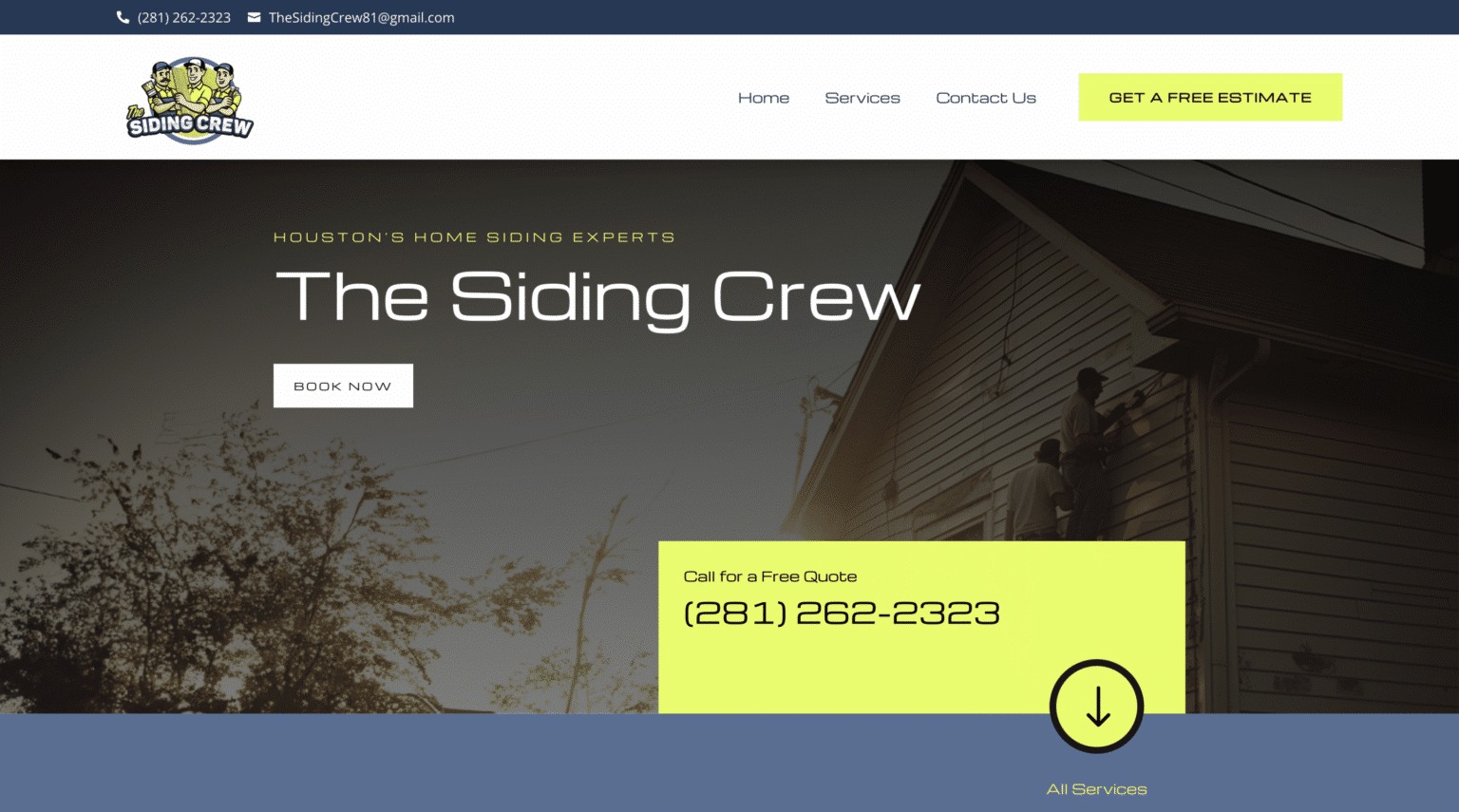
Personality builds recognition. Recognition builds trust. For small businesses, trust is often the deciding factor.
Speed has become part of the brand experience
A slow website used to be dismissed as a technical issue. Now it is part of how customers judge your business.
People may not know why a page feels slow, but they absolutely feel it. They hesitate. They bounce. They lose confidence. On a practical level, slower pages often hurt search performance too, especially on mobile. On a human level, they create doubt. If the site feels outdated or sluggish, visitors start wondering whether the service will be too.
This year, speed is shaping design choices in visible ways. Businesses are using lighter images, fewer unnecessary animations, cleaner code, and more disciplined page structures. Designers are becoming more selective about what actually deserves motion and what should stay still.
That last point matters. Animation can add energy when used well, but many websites overdo it. Elements slide in from every direction. Counters spin. Backgrounds move. Videos autoplay. The result is not sophistication. It is friction.
A good rule of thumb is simple. If a design feature does not help someone understand, trust, or act, it needs to justify its weight. On small business websites, every extra second and every extra distraction carries a cost.
Strong typography is doing more of the heavy lifting
Typography has always mattered, but it now plays a more central role in how modern websites feel. As layouts become cleaner and copy gets tighter, text has to carry more meaning and more visual authority.
The strongest sites are using larger headlines, clearer contrast, and more disciplined font pairings. They are also giving text room to breathe. That sounds like a small detail until you compare two pages side by side. One feels cramped and tiring. The other feels effortless to scan.
This trend is particularly important for service businesses that need to explain unfamiliar or high-stakes offerings. If you are a financial advisor, a private medical clinic, a contractor offering premium remodels, or a legal practice, your website likely needs to communicate nuance. Strong typography helps people process information without feeling overwhelmed.
There is also a branding benefit. Fonts carry tone. A refined serif can suggest heritage or authority. A clean sans serif can feel modern and direct. The point is not to follow a style just because it is trending. The point is to choose typography that supports the kind of trust your audience needs to feel.
Conversion-focused design is getting smarter
For years, “conversion-focused” often meant one thing: make the call-to-action button bigger. That thinking was too shallow then, and it is definitely too shallow now.
The better trend is toward designing entire pages around decision flow. Instead of dropping visitors into a generic homepage and hoping they figure things out, businesses are structuring websites around the actual questions a buyer asks.
A strong page often moves in a natural sequence. It introduces the service clearly. It addresses pain points. It shows proof. It reduces objections. It makes the next step obvious. When this is done well, the page feels helpful rather than pushy.
This is where website design for small business tends to separate itself from design built for large national brands. Small businesses often rely on fewer visits and a shorter sales path. They cannot afford to waste attention. Every page should earn its keep.
A plumber does not need a poetic manifesto on the homepage. They need clear service categories, fast contact options, visible service areas, and proof that they are reliable. A boutique interior designer, on the other hand, may benefit from a more immersive visual experience because clients are buying taste as much as service. Good design follows the decision context.
That is the trend worth watching: not louder calls to action, but more thoughtful page architecture.
Trust signals are becoming more visual and more immediate
People have grown skeptical online, and for good reason. A clean site alone no longer guarantees trust. Visitors look for proof, and they want to find it fast.
That proof is becoming more integrated into the design itself. Testimonials are appearing closer to calls to action instead of hidden on a separate page. Review scores, certifications, partner logos, before-and-after images, guarantees, and process snapshots are being used more strategically. Team photos are replacing faceless placeholders. Contact information is easier to verify. Maps, service areas, and local references are more prominent.
The key is authenticity. A wall of five-star quotes with no names, no context, and no specificity does not help much. One honest testimonial that mentions the exact project, turnaround time, and result can do far more.
I have seen local businesses transform results just by tightening how they present credibility. Not by inventing anything new, but by making real proof easier to notice. A roofing company moved its financing information, warranty details, and recent project photos higher on the page. Leads improved because visitors did not have to hunt for reassurance.
Trust is not a separate section anymore. It is becoming part of the visual structure of the site.
Local relevance matters more than broad appeal
For small businesses, Scalable Websites web design the woodlands especially those serving specific towns or regions, local cues are becoming a stronger part of effective web design. This is not about stuffing city names into every paragraph. It is about building a site that feels situated.
A visitor wants subtle confirmation that you know their area and can serve them well. That might show up through neighborhood references, local case studies, region-specific imagery, service area pages, or copy that reflects how people in that market actually talk.
This matters for both users and search visibility. When someone searches for web design The Woodlands, they are not just looking for technical skill. They are looking for a business that feels accessible and relevant to their market. The same is true in almost every local industry, from dentists to landscapers to accountants.
Broad, one-size-fits-all copy weakens that connection. Local specificity strengthens it.
Accessibility is moving from nice-to-have to expected
Accessibility used to be discussed mostly in compliance terms. That is changing. More businesses now understand that accessibility overlaps with usability in practical, everyday ways.
Readable contrast helps everyone. Clear button labels help everyone. Logical heading structure helps everyone. Captions on video help more people than most owners realize. Forms with clear error messages reduce frustration across the board.
The design trend to watch is not flashy. It is mature. Sites are becoming easier to use for a wider range of people, and that tends to improve performance for all visitors. A website that is easier to read, easier to navigate, and easier to understand will almost always convert better.
Small businesses do not need to become experts in every technical standard overnight. They do need to stop treating accessibility like an afterthought. It belongs in the design conversation from the start.
Fewer pages, better pages
A surprising pattern this year is the move away from bloated websites. Many small businesses are realizing they do not need dozens of thin pages saying almost the same thing. They need a smaller number of stronger pages with clearer purpose.
This does not mean tiny sites always perform best. Some businesses need robust service pages, location pages, and resources. But a leaner content strategy often wins because it forces discipline. Each page has to answer a question, support a service, or move someone toward action.
That also helps with maintenance. A website is not a brochure you print once and forget. It needs updates. If your site has forty weak pages, most of them will age badly. If it has twelve well-built pages, you are far more likely to keep them current.
For owners who feel overwhelmed by redesign decisions, this is often the smartest place to start. Do less, better.
Visual storytelling is replacing generic image filler
Photography and video are still powerful, but the way businesses use them is changing. The goal is no longer to fill space with something attractive. The goal is to tell the truth of the business in a way that builds confidence.
A contractor showing a real job site, with clean staging and process shots, often outperforms a glossy stock image of a smiling model in a hard hat. A bakery showing actual product textures, packaging, and behind-the-counter moments can create appetite and trust immediately. A consultant speaking plainly in a short video can establish authority faster than three paragraphs of vague claims.
There is a trade-off here. Original visuals take effort. They require planning, decent lighting, and some editorial judgment. But they create separation, and separation is hard to buy any other way.
If budget is limited, do not try to produce a huge library all at once. Start with the most important moments and pages. A few strong, honest visuals usually beat a gallery of forgettable filler.
What deserves your budget this year
Most small businesses do not have unlimited room to experiment, so prioritization matters. If you are deciding where to invest in web design, focus on the areas most likely to change outcomes rather than just appearances.
Here is where I would put attention first:
- Mobile usability, especially calls, forms, and page speed
- Clear messaging on your most visited pages
- Original trust-building visuals and proof elements
- Simpler layouts with stronger hierarchy
- Local relevance if your business depends on a defined market
That order will vary by industry, but the principle holds. Fix friction before you decorate. Clarify before you embellish.
The trend beneath all the trends
If there is one idea tying all of this together, it is this: good design is becoming more honest.
The best small business websites are not trying to impress visitors with volume, effects, or vague promises. They are trying to make decisions easier. They are reducing doubt. They are reflecting the real strengths of the business with more discipline and more confidence.
That is why these trends matter. They are not arbitrary style swings. They are responses to a more impatient, more skeptical, more mobile audience. Businesses that adapt will feel easier to trust and easier to buy from. Businesses that do not will keep wondering why decent traffic fails to turn into real leads.
A modern website should feel like your best employee. Clear. Capable. Credible. Easy to talk to. If yours still feels like an old brochure sitting online, this is the year to change that.
The opportunity is not to look trendy for its own sake. The opportunity is to build a website that feels current because it works the way people now expect. That is the kind of web design investment small businesses rarely regret.
Scalable Websites
Website design for contractors and small businesses
Based in Montgomery, TX, serving Montgomery County and greater Houston
Phone: (832) 979-2478
Website: scalablewebsites.com
Hours: Monday to Friday, 8 AM to 5 PM
Scalable Websites builds and manages mobile-first websites for contractors and small businesses on simple monthly plans, with hosting, security and unlimited updates included. Find us on Google.